
I tried out the Landing Page Builder from Aweber. Here’s my review and user experience.
It has been a long, slow and bumpy road for me going from copywriter who serves clients to content seller who runs a PLR membership and mailing list.
I’ve used Aweber for years but I’m only now trying the landing page option. I don’t even know how long it’s been an option, honestly.
But recently I was noticing that a fabulous newer marketer makes really gorgeous landing pages. They really make you want to sign up!
I don’t have the HTML skills to do that for myself. So I decided to explore what’s going on with Aweber and their landing page builder.
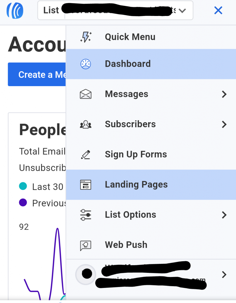
It’s super easy to get to the landing page builder. Just log into your Aweber account and find the option in the top dropdown.
What’s the goal for your landing page?
Envision a goal for your landing page. People land on your page from somewhere. Now where will they go next, and how will you compel them to get there?
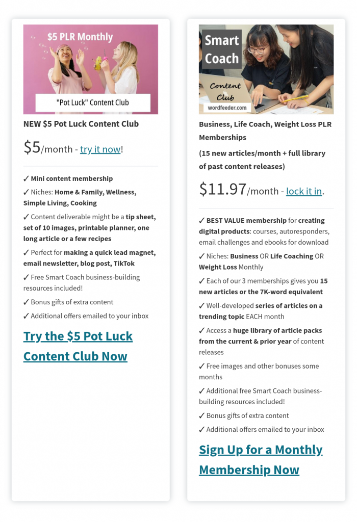
The goal for my Wordfeeder landing page is to make people aware of our high value written content memberships and compel them to sign up.
Let’s walk through the landing page creation process in Aweber.
With my end goal in sight, I navigated inside my Aweber account to the landing page builder area.
There are tons of template selections, and that can be overwhelming. Match their landing page to your purpose. In my case, I was looking to clearly lay out PLR membership offerings.
I found a bright-looking landing page template that I liked. There was space for a big picture. In their example, they showed a smiling woman.
![]()
I had to get a good picture of myself, which is difficult. So I managed to locate one that’s decent, and popped it in.
The picture is huge and I don’t know how comfortable I am with that… but there wasn’t any way to reduce the size.
Wow, that’s a big picture of my face.
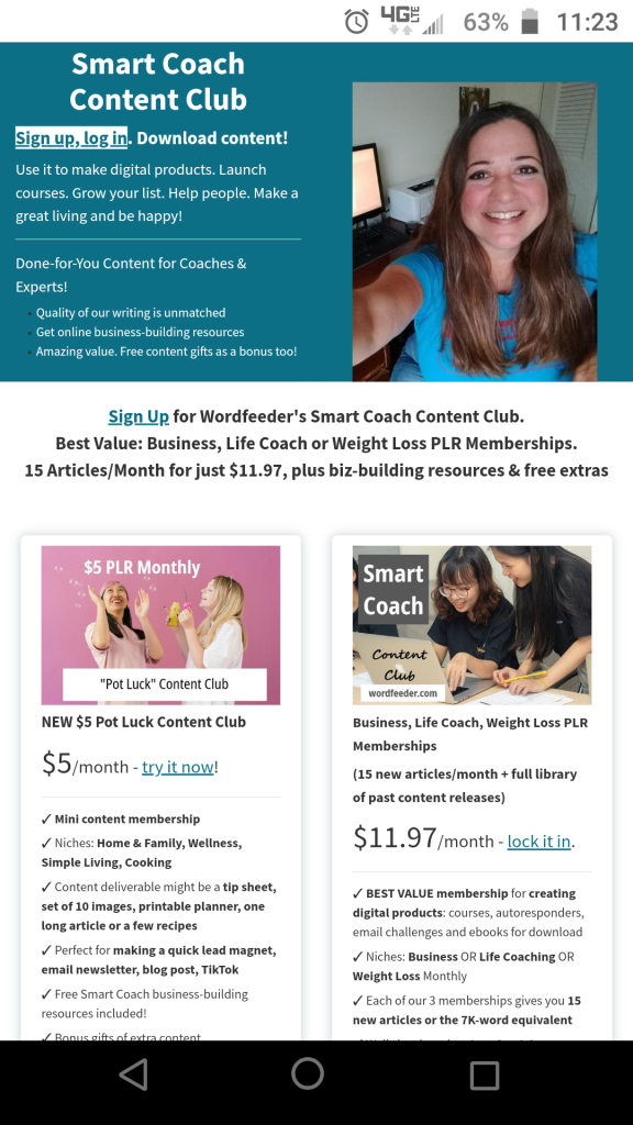
I will link to my landing page in this screenshot just in case you’re curious to see the end result.
In hindsight, it may have been possible for me to trash that image box and pull in a new one and resize it that way. I will have to explore that next time.
For now, we’re going to experiment with a huge picture of my face and see if it helps me get more people excited about the Wordfeeder done-for-you content membership.
Input your content into the landing page template. Easy peasy.
The easiest part of this was inputting the content. The template already has everything in a pleasing space. You get options to change and tweak things. Adjust alignment, add content elements and things like this.
But what about those Aweber buy buttons?
The main challenge that I actually found confusing was the part where people who land on the page click the buttons.
This is about logistics.
Clicking a button would initiate an action of some kind. That’s the purpose.
So as you create your landing page you want to decide if your button will trigger a sale, or a sign up. Maybe you’ll have both options on your landing page, like I did.
My main confusion was that I integrate my membership with Amember and Aweber
People who aren’t familiar with these companies will find this confusing, and rightly so. The name is almost the same but they’re entirely different.
My PLR membership runs off Amember. I want people to sign up by clicking a link and then creating a new member profile in Amember. Hence the name.
So how do they do that if they’re currently on a landing page that I made in Aweber?
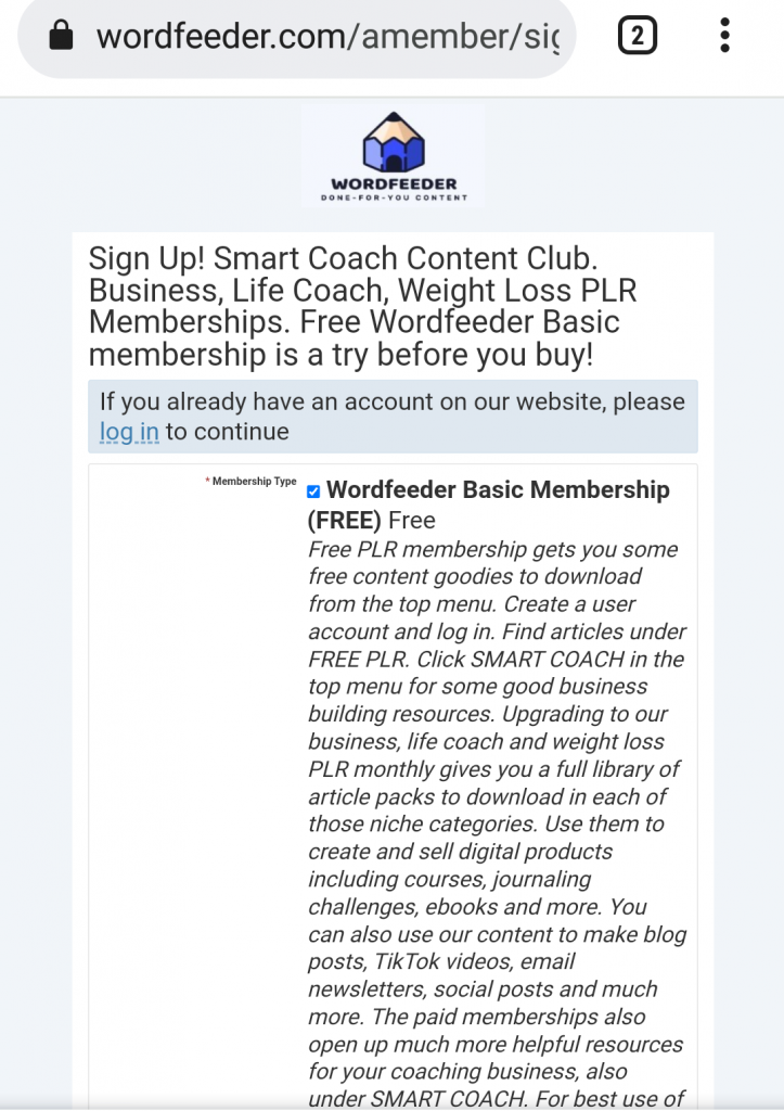
Ideally, those buttons would let you click them and then you’d be transported via a link to the Amember sign up page.
That’s a screenshot of the destination signup page in Amember
The problem is that the pretty buttons are configured to ONLY go to a product that you create in Aweber.
I searched high and low to find a way to add a plain old link (meaning my own link) to the buttons in the Aweber landing page template I was working in.
It seemed that the only option was that if users clicked the button, they would be prompted to enter their credit card information and purchase a product, which you yourself would have to create and set a price etc. in Aweber.
So I ended up having to delete the buttons, which I really liked the look of.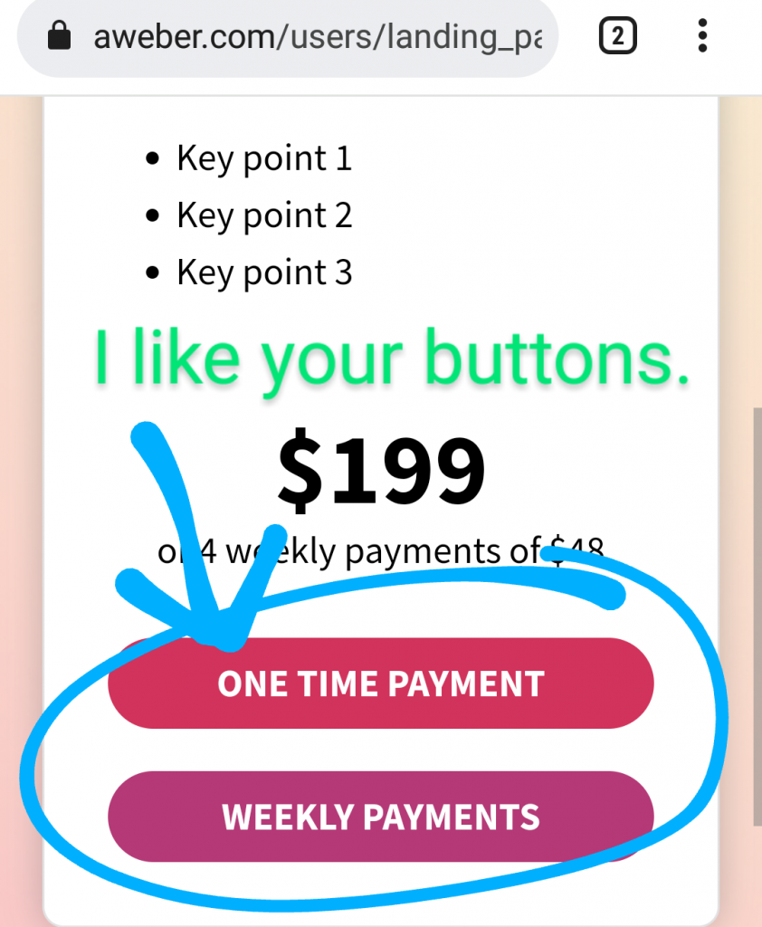
I couldn’t figure out how to make my own button in Aweber that I could set a link that is clickable and goes to the signup page that I want.
But I was able to add my own links in the landing page text input area.
In lieu of the buttons, I did add links. You’re able to add a clickable link in the text area. But the link doesn’t open to a new window. There doesn’t seem way to be a way get at the source code to change that.
So I ended up putting the link in several prominent areas so that people will land on the landing page, read about each membership and what they get, and then click one of the links to sign up.
I understand that Aweber would want people to start collecting users credit card information via their program. But a lot of people are not going to want to give out their credit card info just yet.
Also, there should be a PayPal option when creating your product in Aweber.
So my end result was that I do like the look of the landing page that I built in Aweber.
It was easy to set up and input content.
I feel that the large image and simple bulleted copy points might keep users engaged and wanting to take the next step.
Another thought. In the layout I didn’t see a way to close up space in the header area. The screenshot I showed you required me to scroll. If you actually visit the landing page you will see dead space at the top that I could not get rid of.
The good thing about the Aweber landing page builder is that you can log in whenever you have a free moment, and continue to tinker with the layout.
Then I update the page, and your changes will be reflected live.
Another thing I’m noticing is that it would be better to have the membership options show up above the scroll on a smartphone. Right now, users must scroll just to read about what they get.
To fix this I could just condense the content. A thought for another day.
Side note, the delete button is your friend.
The landing page template I chose also included a bunch of what I guess would have been testimonial areas that were styled.
Here’s a screenshot.
Their layout included space with people’s pictures and some text areas to input more copy.
I just deleted all of these to make it more simple.
If you’re looking at an element of your landing page and you can’t figure out what to put there, it might help to just delete it, honestly.
Because if it’s too complicated for you, it’s probably going to be too complicated for your readers. They won’t stay long enough to hit that sign up button or click the link.
My Aweber landing page wish list is short
If I had to give a wish list for features I would like to see in that landing page builder, it’s that the buttons would actually go to a plain old link that you input yourself.
I really liked the buttons. They were bright and big and prominent on the page and the layout was clean.
Oh, and I also think there should be one more little tweak. The landing page should give people an option to switch to the desktop view if using a smartphone.
When I checked my landing page from my smartphone, it did not look the same way that it looked on my desktop computer.
The nice-looking, clean layout became visible again once I switched to the desktop view on my phone.
It might be helpful for there to be a tiny link on that landing page. The link can say “switch to desktop view”.
If I had to rate the overall user experience of creating a landing page in Aweber, I would give them 4.5 out of five stars!
I definitely recommend Aweber if you’re looking for a good list manager and landing page creator that’s easy and intuitive to use.
Thanks for reading this all the way to the end! If you’re interested in getting a done-for-you membership to create digital products quickly and easily, check out Wordfeeder.com